Coterie Baby
under the direction of Rachel Gingrich (Assistant Art Director) and Aimee Brodeur (Director of Operations, Brand & Creative)
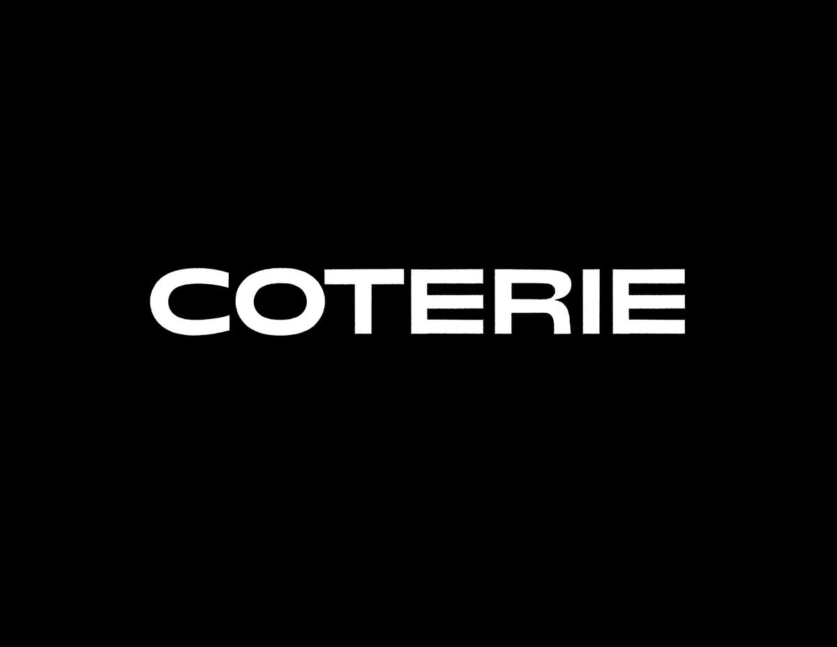
Working alongside Coterie’s in-house design team, I was hired to create a new logotype for the baby companies rebranding; which will launch in Fall 2022. The goals of the project were to develop a logotype which had a timeless warmth and balanced modern feel. Ideally, something which would feel familiar and sleek to their existing customers and exciting to new comers. Their vision was that this new logotype ultimately would become a tool that the in-house team could effortlessly use across mediums; from diaper packaging to websites. The team expressed the existing logotype felt “bubbly” and “unstable;” likely due to the prior logotypes stroke modulation, spacing, and the inconsistency of letterform x-heights. Comparison shown below.
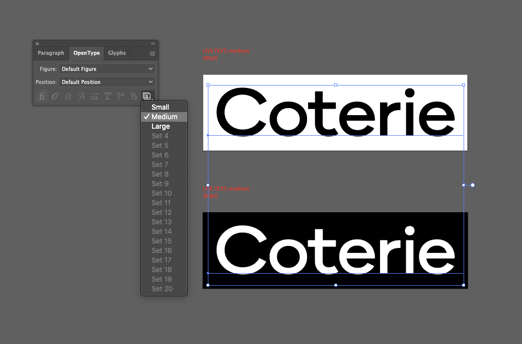
With these concerns in mind, the project began by exploring a range of letter styles which included playing with construction, width, weight, and how the logotype could have a “wink of play” through kinetic movement. Sketches are shown below. These initial direction conversations with the in-house team and stakeholders helped to narrow the goals for the rebrand and thus logotype. Through the process, a medium weight, low contrast (mono weight), sans-serif, in capital-case... with humanist hints in the letterform’s terminal endings came into being. The final phase of the project entailed drawing the final logotype for different application types; small, medium, and x-large. Because the team requested a tool-like logotype, I used OpenType features (Stylistic Sets) to nest all the forms together in one font. This provided easy access to the different cuts via a menu drop down. Screenshot shown below.
Final documentation of application of the logotype is forthcoming as the rebrand launches this fall!

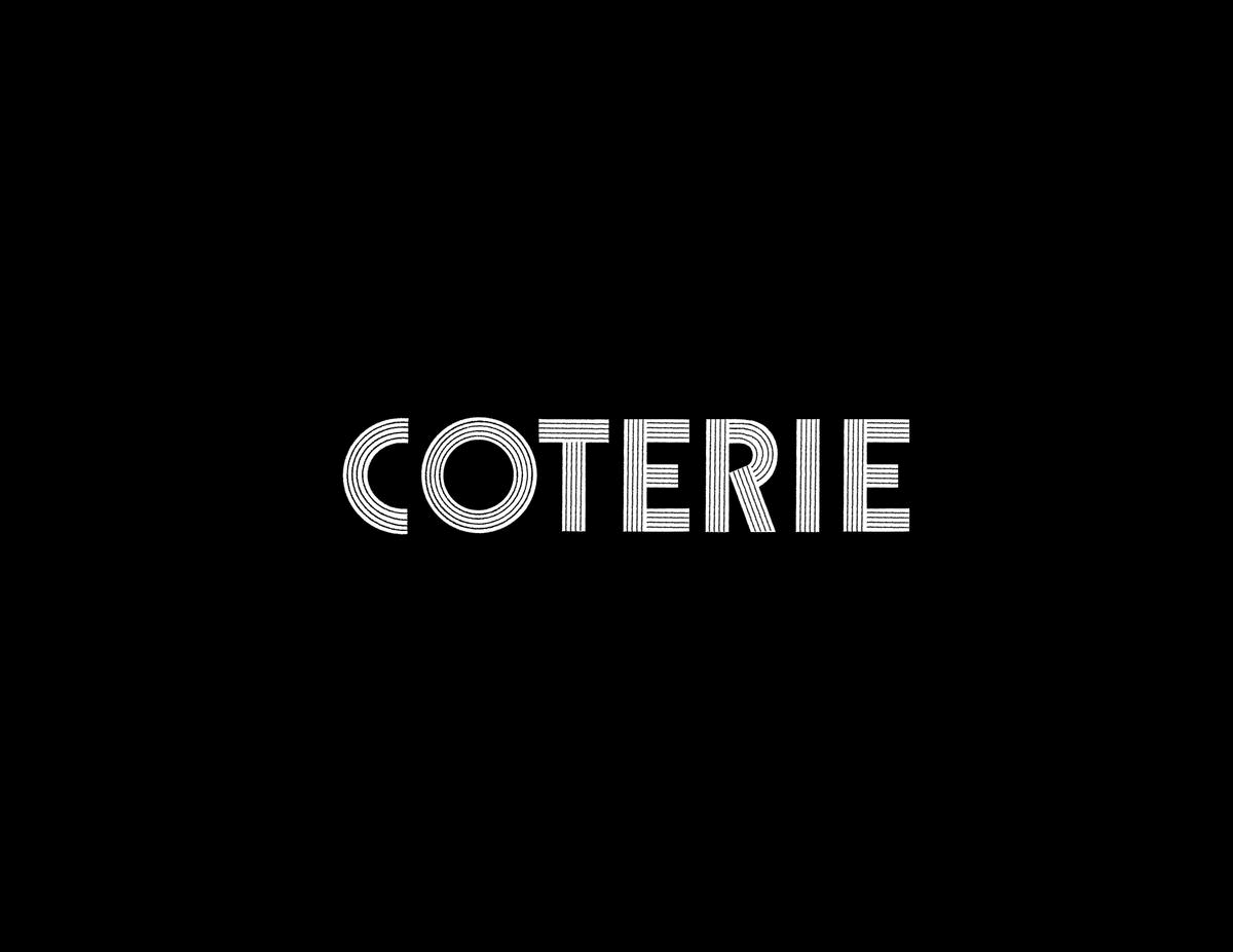
Original ↓
![]()
![]()


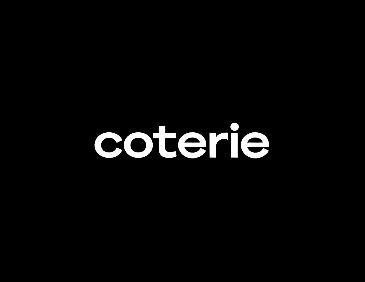
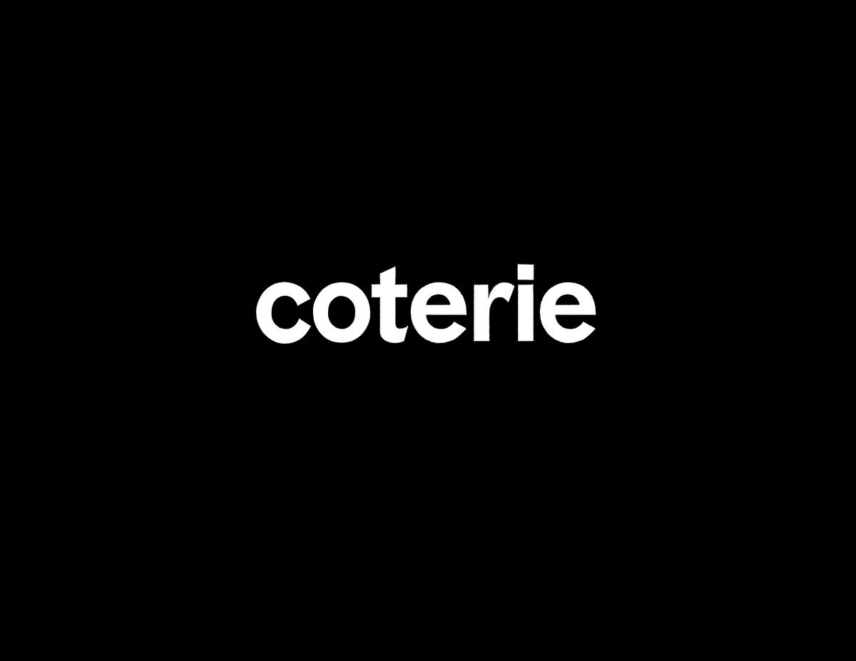
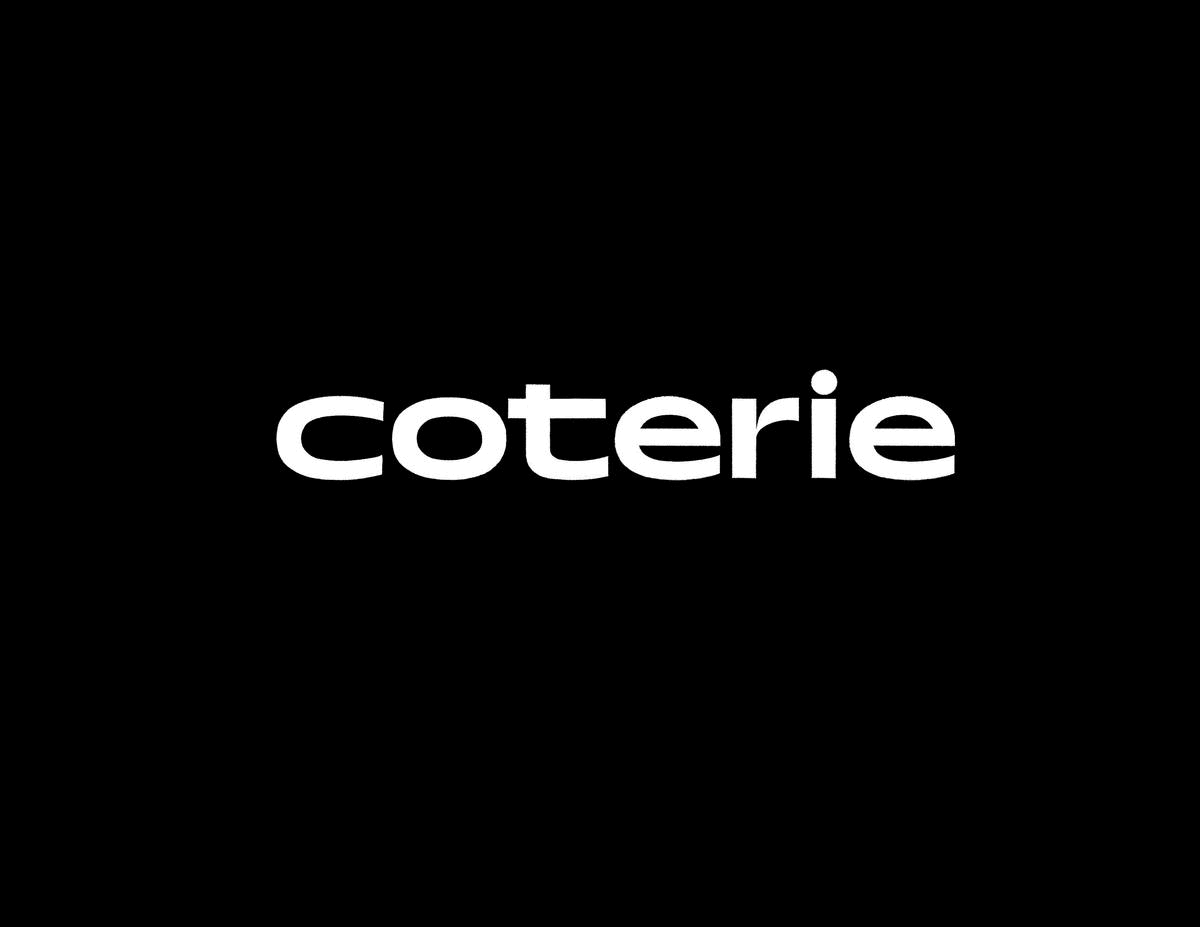
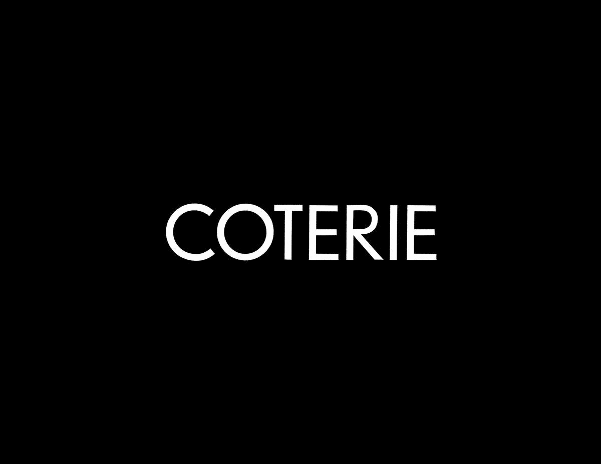
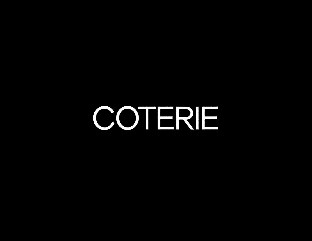
Final Revised Logotype ↓
![]()
![]()


Final Drafted Forms →

OpenType Features →
Exploration & Process
with Kinetic Storyboards →
with Kinetic Storyboards →